Case study · Beewell Indonesia
Turning a newsletter signup into direct school inquiries
- UX Audit
- Web Design
- Information Architecture
- Prototyping
Status: Prototype · inquiry form shipped
- Role
- UI/UX Intern, sole designer
- Team
- IT Team 4 developers 1 designer
- Timeline
- Jul - Oct 2026
- Tools
- Figma, HTML/CSS/JS, Vercel
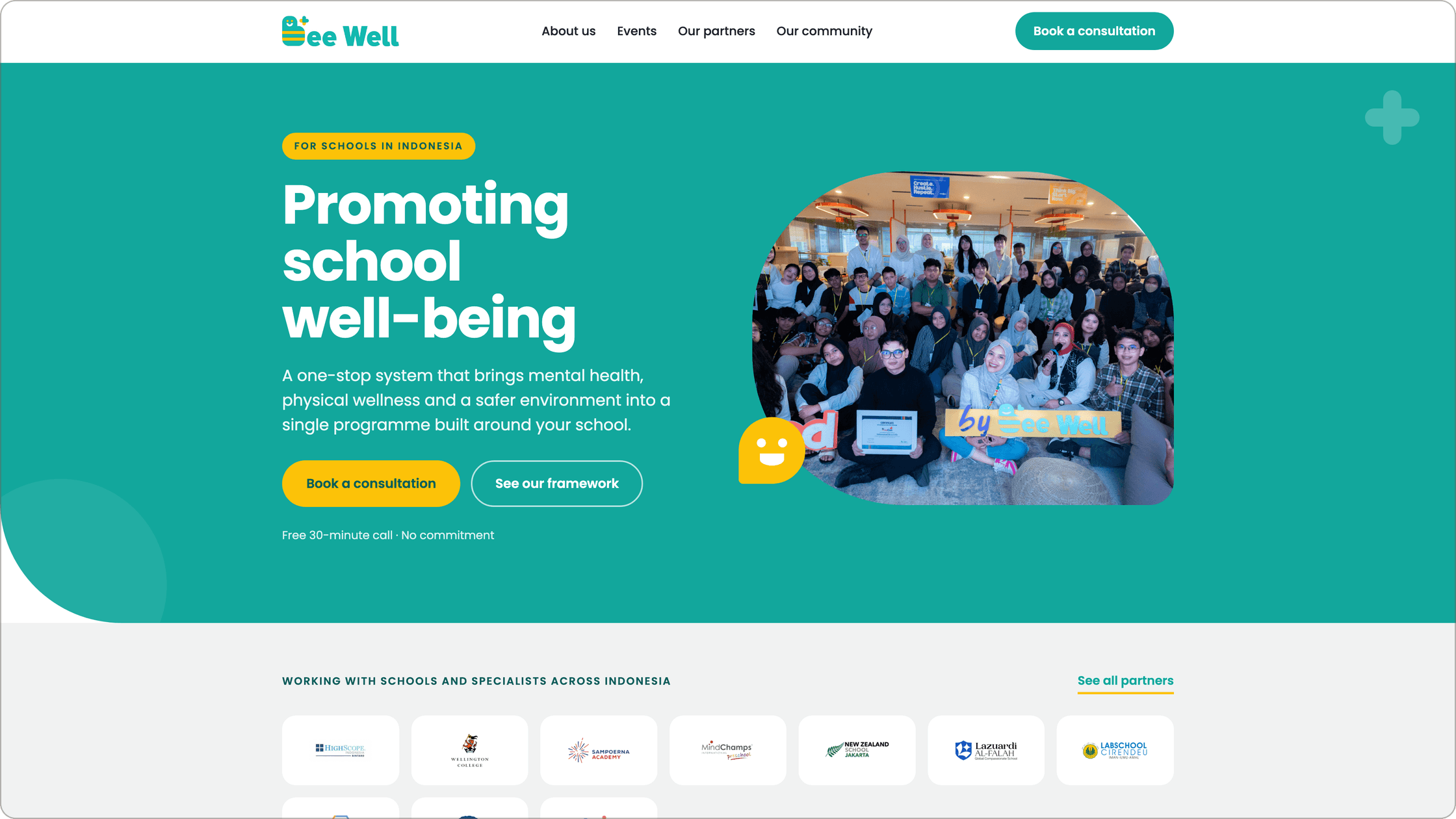

At a glance
A clear way in for schools
As the sole design intern, I redesigned Beewell’s 4-page site around two audiences, school leaders and parents. Replacing a newsletter-only signup with a direct inquiry form raised monthly school inquiries by 60%, from 5 to 8.
+60%
monthly school inquiries, from 5 to 8
4
pages redesigned, plus 3 new pages
1
all-hands presentation to the whole company
Context
Beewell Indonesia is a school wellbeing consultancy. Its website explained what it did, but gave visitors almost no way to act on it.
As the sole designer during my internship, I audited the existing homepage and redesigned the 4-page website.
Problem
Three things held back sign-ups
Visitors could learn what Beewell did, but the site gave them nowhere obvious to go next.
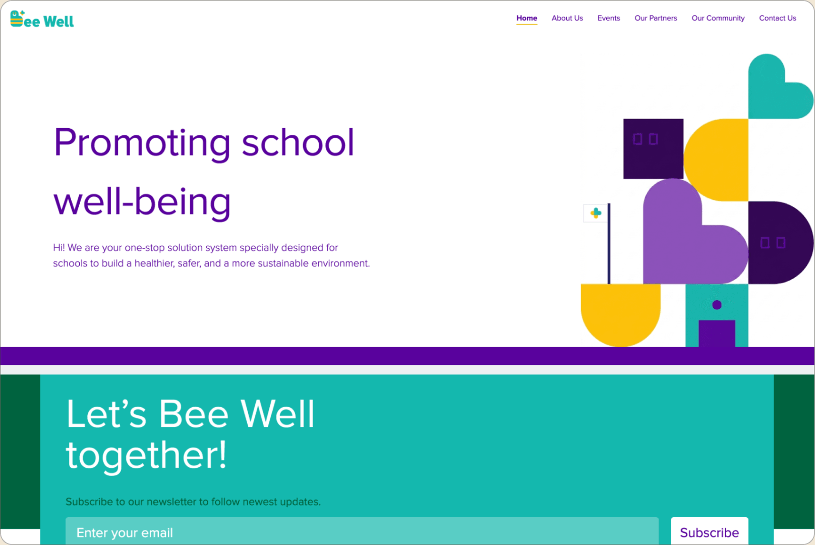
- The logo wasn't clickable, so there was no easy way back home.
- The hero had no call to action.
- The only way to capture interest was a newsletter signup.
Process
Designing for schools, parents, and what could be built
I started by auditing the live site to find where visitors had no next step.
I then defined the two audiences the site serves. School leaders and counsellors are the decision makers: they need to see what a programme involves and how to start one. Parents follow along: they want practical help and to know what is happening at their school. Every decision below was checked against which of the two it serves.
I built the redesign as a working HTML, CSS and JavaScript prototype hosted on Vercel, so the team could click through real pages instead of static mockups.
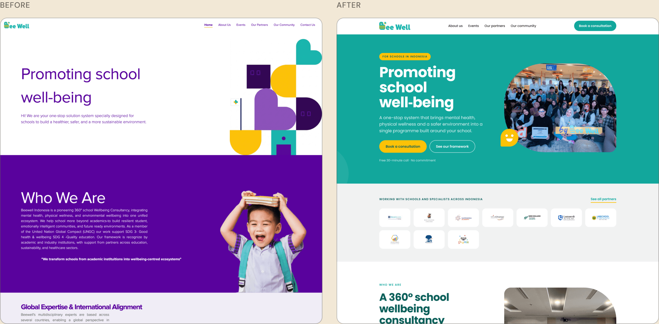
For the visual direction, I looked at Bee Well’s social media, where the marketing team already had a consistent system: only the logo colors (teal, yellow and coral) on white. The old site’s purple appeared nowhere else, so I dropped it to make the website match what schools and parents already recognize from Instagram.
Solution
A clear way in, one piece at a time
7a
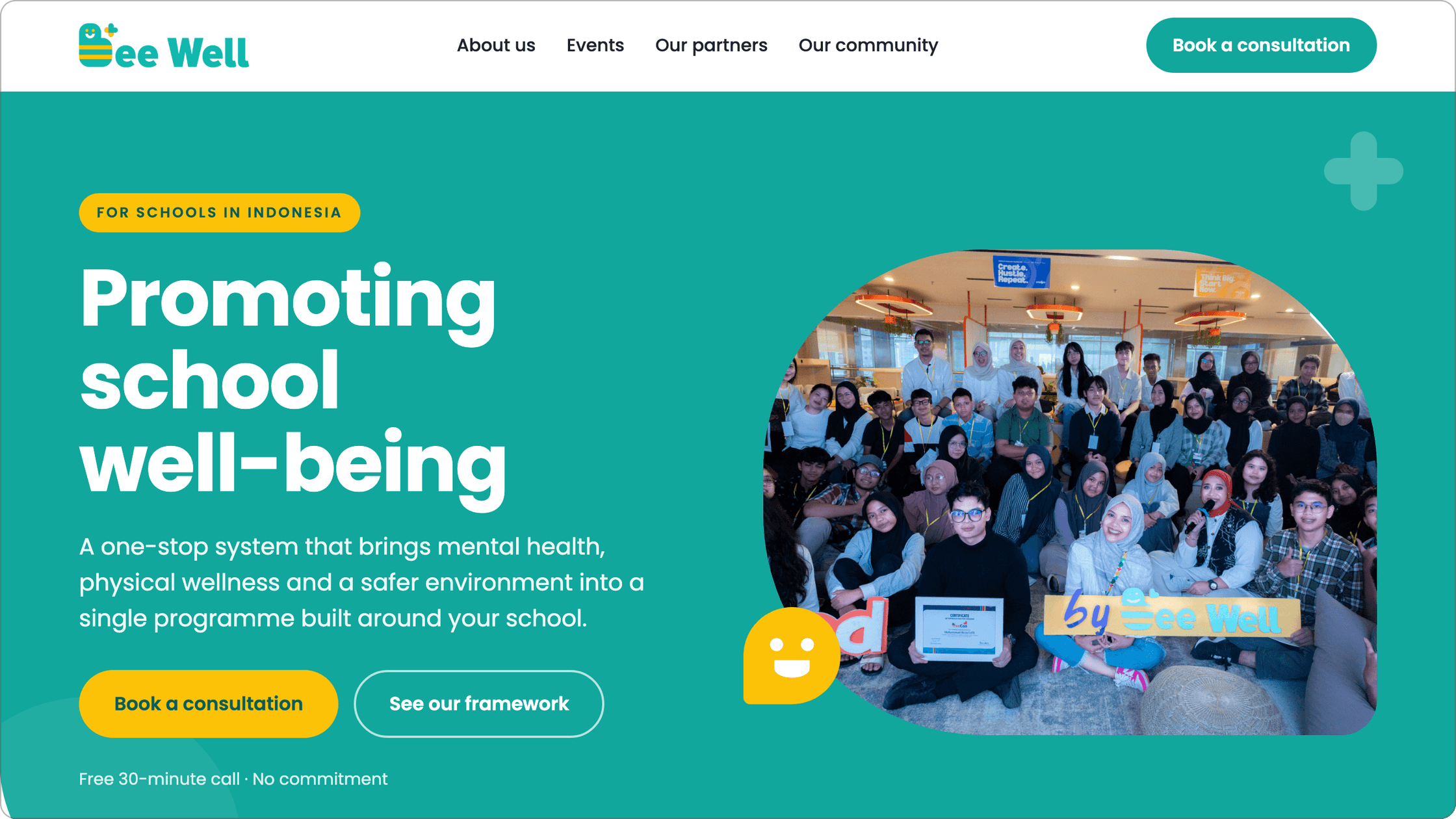
A menu bar and hero that point somewhere
The old hero said what Bee Well does but offered no next step, and the logo didn’t link home. I added a “Book a consultation” button to the menu bar and a primary call to action in the hero, so a school can act from any page without scrolling. A secondary “See our framework” link stays for visitors who aren’t ready to talk yet. The button speaks to school leaders, the audience that can actually book Bee Well.
7b
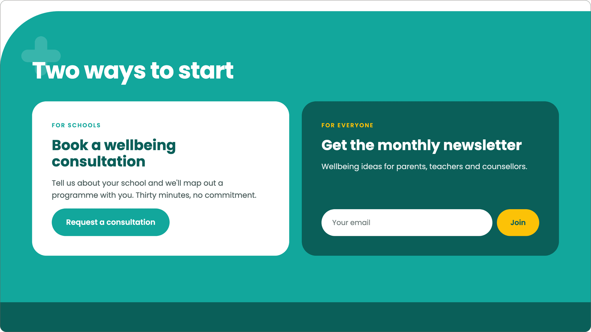
Splitting one signup into two ways to start
The only way to show interest was a newsletter signup, which treated a school ready to commit the same as a curious parent. I split it by audience: school leaders book a consultation, while parents and teachers get the newsletter. This is the change that later became the direct inquiry form.
7c
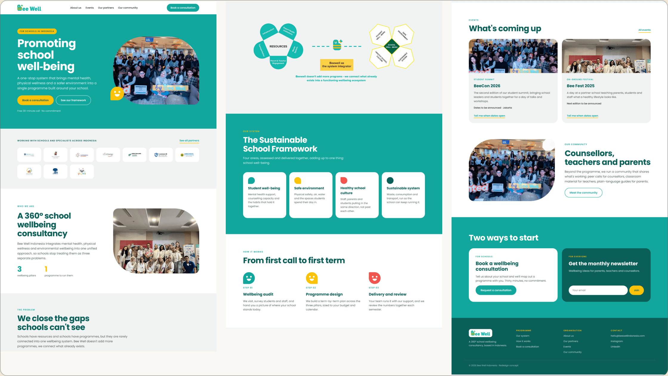
The homepage reads like an argument
I ordered the page like an argument: who Bee Well is, the gap schools face, the framework, how a year works, upcoming events, then the two ways to start. Each section answers the next question a school leader is likely to ask.
7d
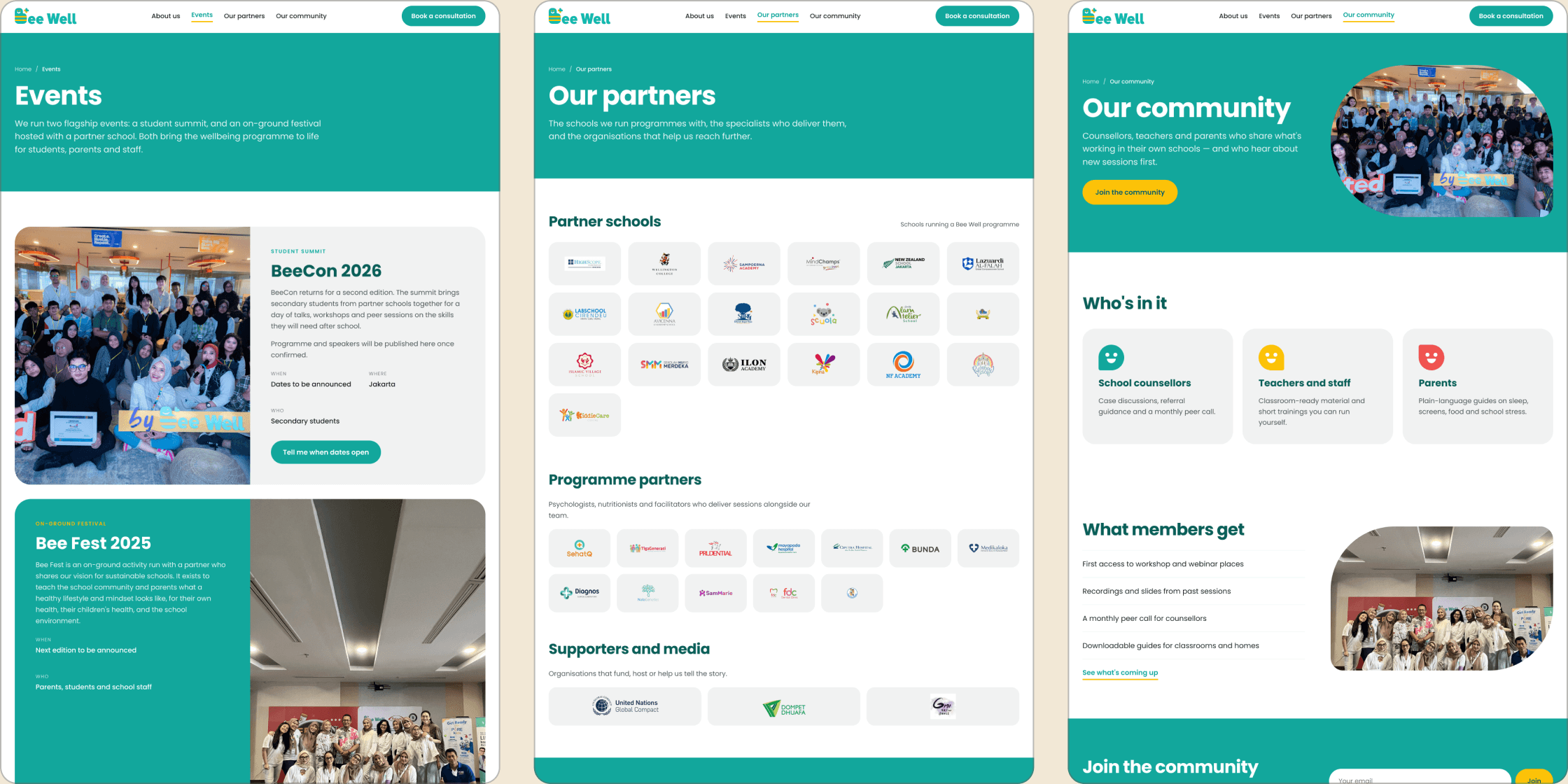
Proof lives on its own pages
Events, partners and community were buried or missing on the old site. Giving each its own page keeps the homepage short, and real partner logos and past events do more to convince a school than claims on the homepage. The Community page is the one built mainly for parents, with plain-language guides.
7e
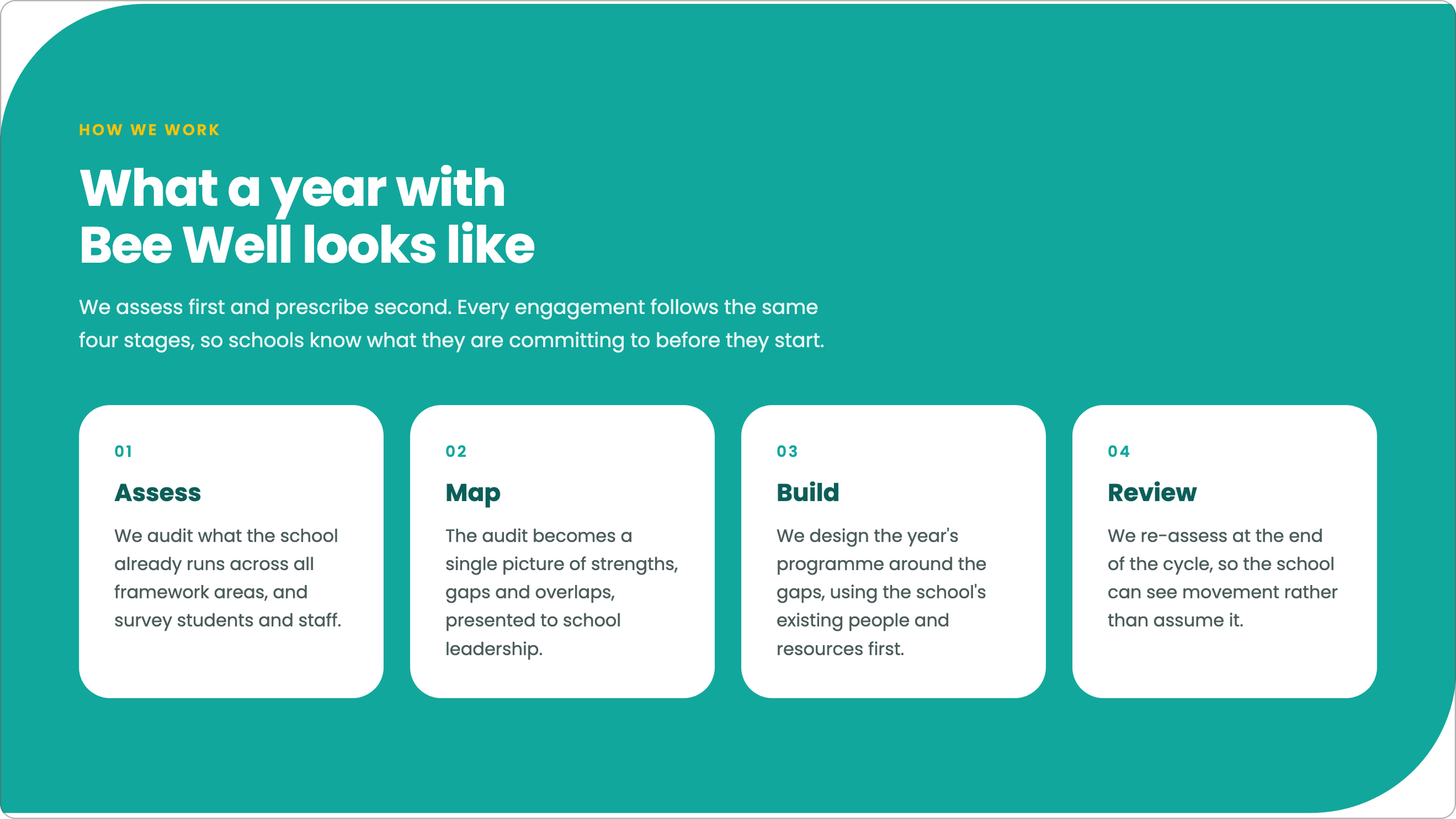
An About Us page with a story and a process
Before booking a call, a school leader needs to know what working with Bee Well involves. The About page answers that with a four-stage year (Assess, Map, Build, Review), so the commitment is clear up front.
7f
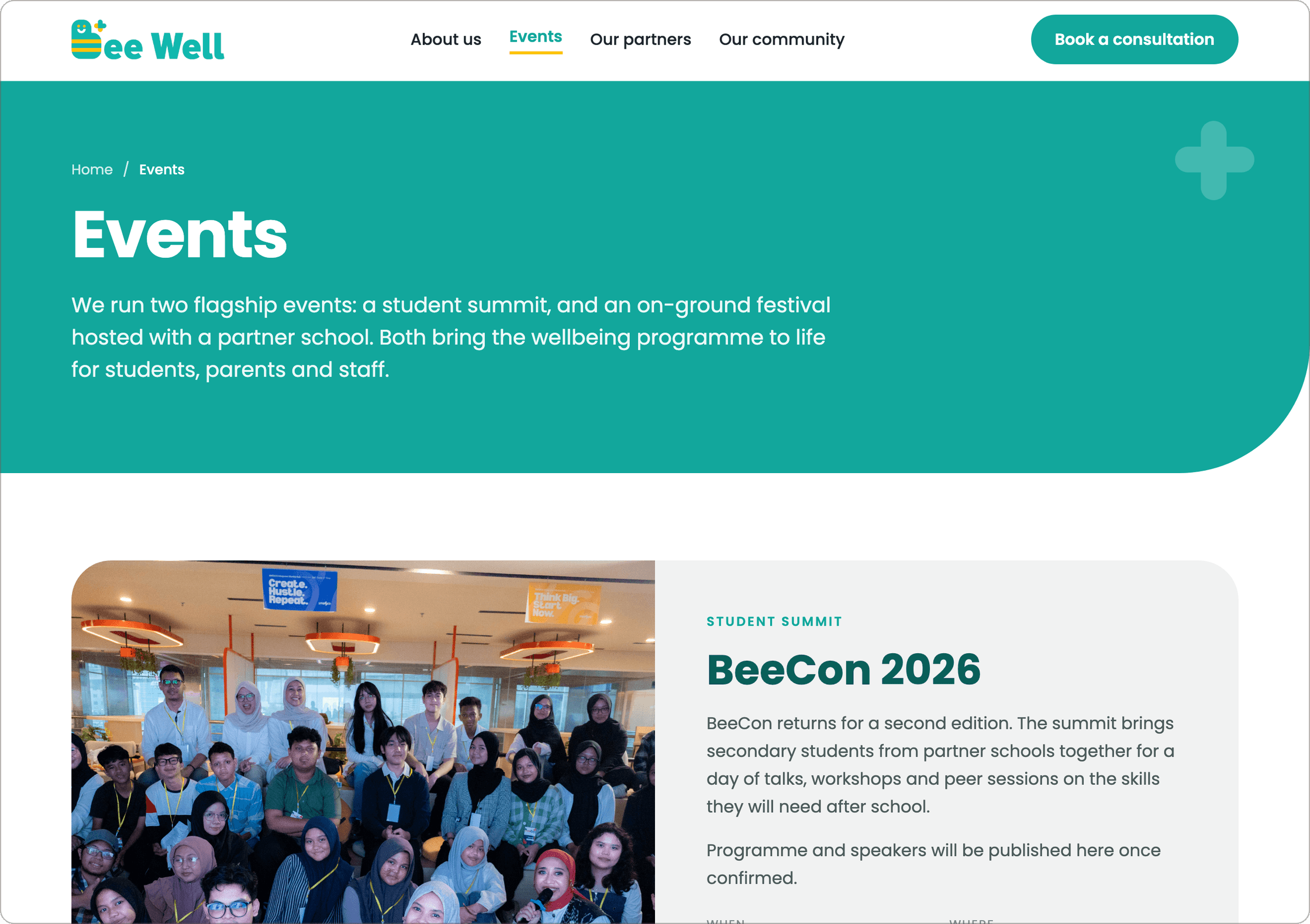
An Events page that stays current
Events change often, so the page had to be easy to keep current. Bee Well already managed its content in WordPress, so I designed the event cards around the details the team already enters for each event, instead of adding a new tool or workflow.
Before / after
Same company, a clear way in
Outcome
From a newsletter to direct inquiries
I presented the redesign to the company at an all-hands meeting. The newsletter-only signup was then replaced with a direct inquiry form for schools.
+60%
monthly school inquiries after the inquiry form launched, from 5 to 8.
Reflection
A clear audience turns taste into decisions
Defining a clear audience early made every later decision easier. Once I knew whether a page was for school leaders or for parents, choices that had felt like taste had a clear answer.
I also learned to set aside what I personally found nice in favour of what fit the brand. Matching Bee Well’s social media meant dropping colors I liked, but it made the site feel like the same organisation people already knew.
Next case study
Helping 11,000+ grad students find their next step
UBC Graduate and Postdoctoral Studies · grad.ubc.ca
Read the case study →