Case study · UBC Graduate and Postdoctoral Studies
Helping 11,000+ grad students find their next step
- Content Design
- UX Research
- Information Architecture
- A/B Testing
- Drupal
Status: On dev site · not yet live
- Role
- Web Strategy & Communications Assistant (Work Learn), Communications and Strategic Initiatives team
- Team
- Jessica Woolman (Communications Manager), communications team, subject matter experts
- Timeline
- Sept 2026 - Present
- Tools
- Figma, Drupal, Google Docs, Crazy Egg, Qualtrics

At a glance
Every page now says what to do next
I audited and rewrote key grad.ubc.ca pages around where a student is in their degree, and built them in Drupal. On the dev site, the redesigned Managing your Program page saw a 65% increase in scroll depth over 2 weeks.
+65%
scroll depth on the redesigned page, tested on the dev site
11k+
graduate students the site serves
5
pages audited against UBC writing standards
Context
grad.ubc.ca serves 11,000+ graduate students at UBC Vancouver, plus faculty and staff. Many pages were written from the institution's side: long flat lists, descriptions that began with "Information about…", and no sentence saying who a page was for.
As Web Strategy & Communications Assistant at UBC Graduate and Postdoctoral Studies, I audit and rewrite key pages, build new ones from scattered source material, and implement them in Drupal. I also lead the community sessions and A/B tests behind the site's wider restructuring.
Problem
Pages listed everything and explained nothing
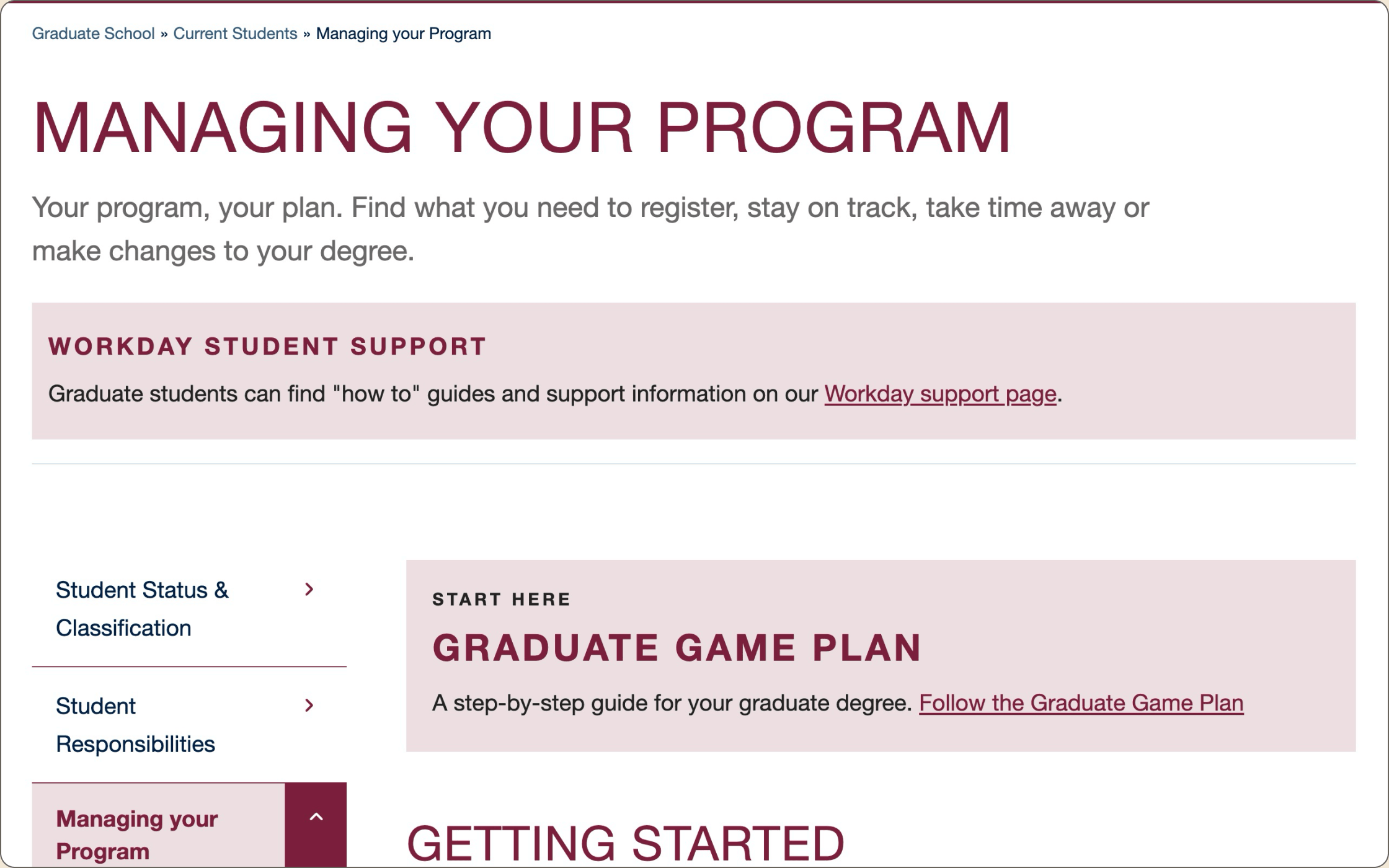
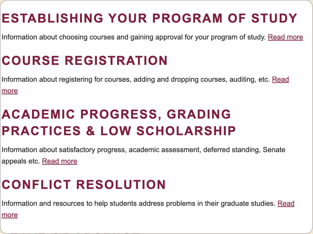
Managing your Program put 17 topics in one flat list. Every description began with "Information about…" and ended in "Read more", and nothing at the top said what the page was for.
My audit found the same patterns across the site: vague links, jargon, missing lead-ins and headings out of order.
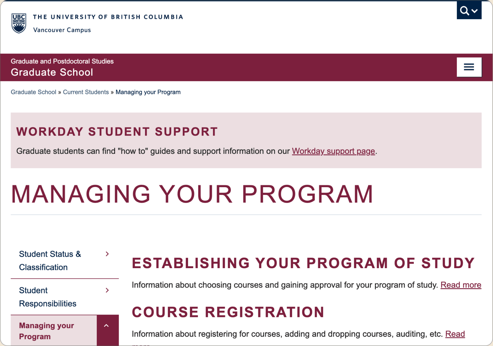
- A Workday banner (an H4) sits above the page title, breaking heading order.
- No lead-in. The title runs straight into 17 ungrouped topics.
- Descriptions start with "Information about…" and end in a vague "Read more".
Research
Asking students, staff and faculty how they use the site
I lead facilitation for roughly 90-minute online sessions with faculty, staff, and students. A community-wide survey covered anyone who couldn't attend.
Recruitment ran through UBC Today, GradGlance, UBC Events, and partner channels, with registration in Qualtrics.

Key insights
Insight 01
People arrive with a task, not a topic
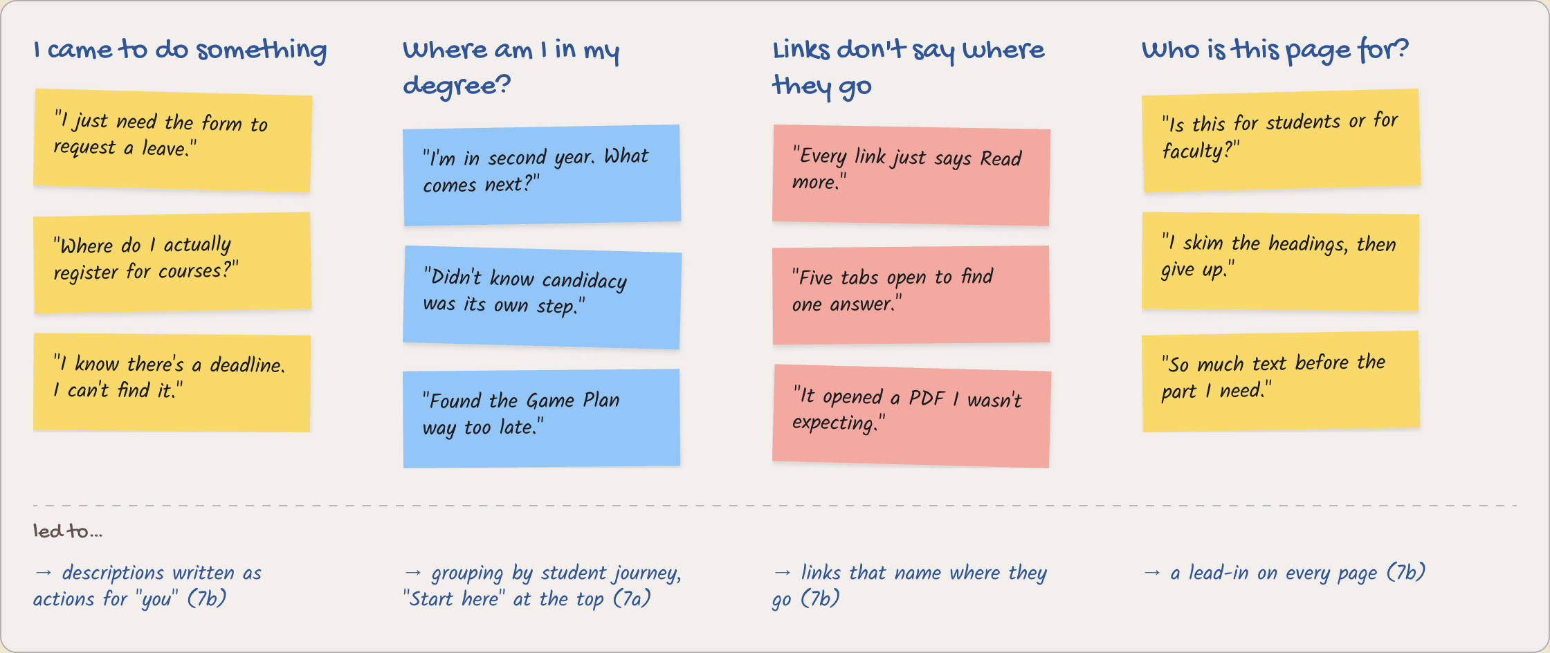
Asked about their last three visits, people described actions like registering or requesting a leave, not subjects they wanted to read about.
Insight 02
Students think in degree stages
In the card sort, groups formed around where someone was in their degree, not around the office or policy behind a page.
Insight 03
Readers skim, then leave
People said they scan headings and links first, and leave a page that doesn't say early on who it's for.
Redesign
Each change answers a problem from the research
Each change answered a problem from the sessions and the content audit.
7a
Grouping by student journey
I grouped Managing your Program's 17 topics under four headings that follow a degree from start to finish: Getting started, Staying on track, Changes and time away, and Work and benefits. The Graduate Game Plan moved from the bottom of the page to a "Start here" link at the top.
I first tried sorting by program type (course-based master’s, thesis-based master’s, PhD). But most topics apply to everyone, so students would still scroll past repeats. Ordering topics by when a student needs them, from registering to graduating, matched how people described their degree in the sessions.
Before
After
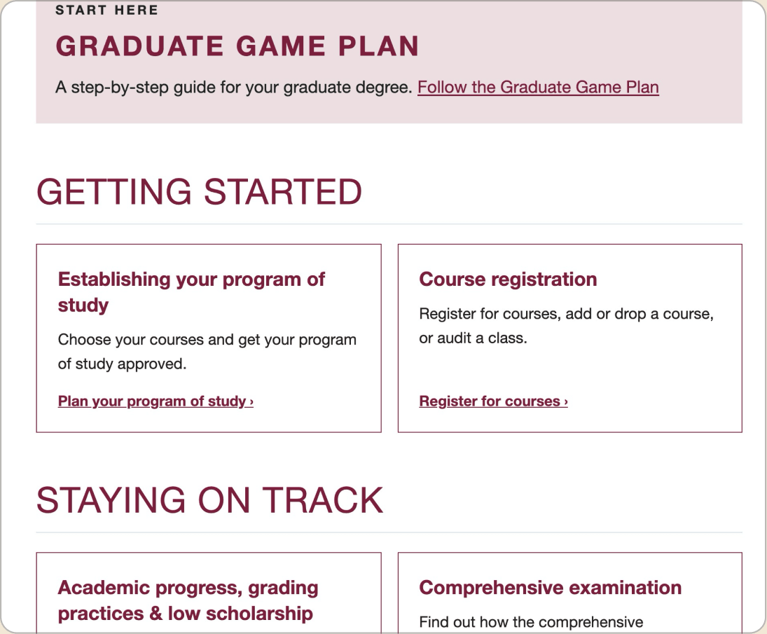
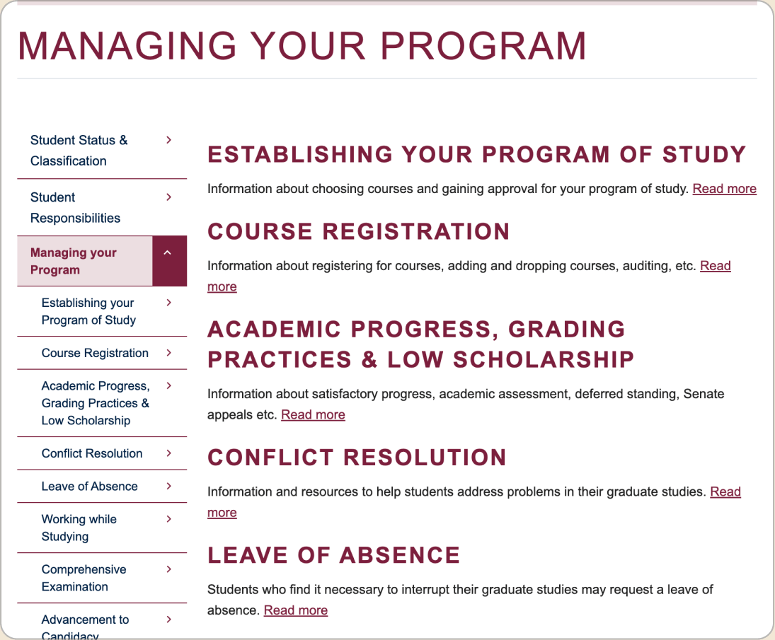
- Before: 17 topics in one flat list.
- After: the Graduate Game Plan moved from the bottom to a "Start here" link.
- After: topics grouped under four student-journey headings.
A student scans four headings instead of 17 links.
7b
Content clarity, grounded in standards
I audited Managing your Program, Life in Vancouver, Student Responsibilities, the homepage and the Blog against the G+PS Writing Guidelines, UBC Voice and Tone Guide, G+PS Web Styles and a content checklist.
Most fixes were at the sentence level: descriptions rewritten as actions addressed to "you", "Read more" replaced with links that say where they go, and a lead-in on every page.
I fixed links and headings first, because the sessions showed people skim before they read. Longer rewrites came second.
Before
After
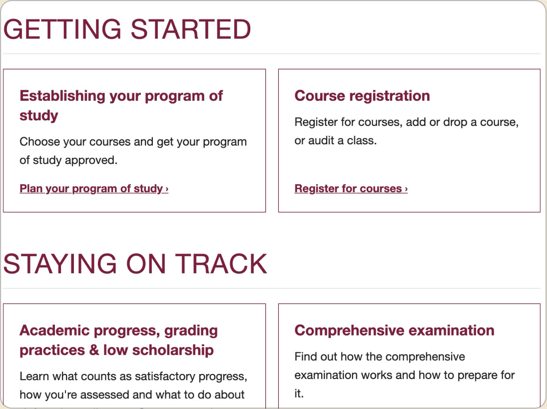
- "Read more" became a link that names where it goes.
- "Information about…" became an action addressed to "you".
- All-caps headings became sentence case, so they're easier to scan.
Every edit traced back to a written standard, so changes weren't a matter of taste.
7c
Restructuring without cutting
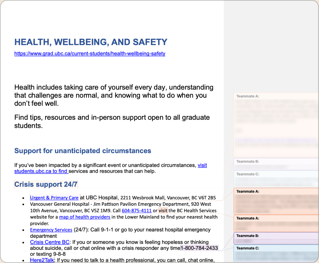
I built two new pages, Health, Wellbeing and Safety and Life as a Grad Student, from scattered resource docs and comments from several team members.
Content owners worried about losing accuracy, so I grouped and reordered their text instead of silently removing it, and only cut sections the team agreed to drop.
This took longer than rewriting from scratch, but owners approved changes quickly because nothing they wrote disappeared.
Before
After
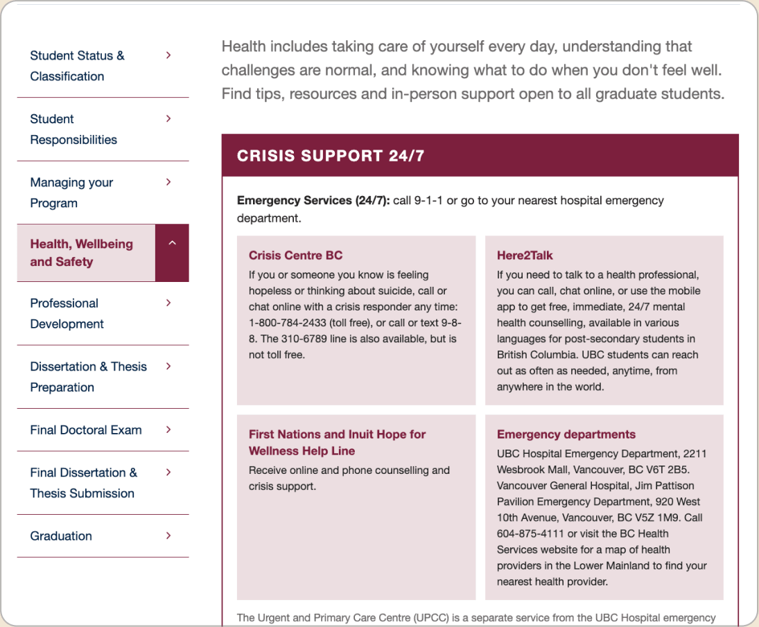
- Before: source text spread across a draft doc with comments from several team members.
- After: crisis support grouped into one block at the top of the page.
Change what a student sees first, not what the page says.
7d
Getting buy-in
I presented my recommendations to my manager as a memo, citing the style guide rule behind each one.
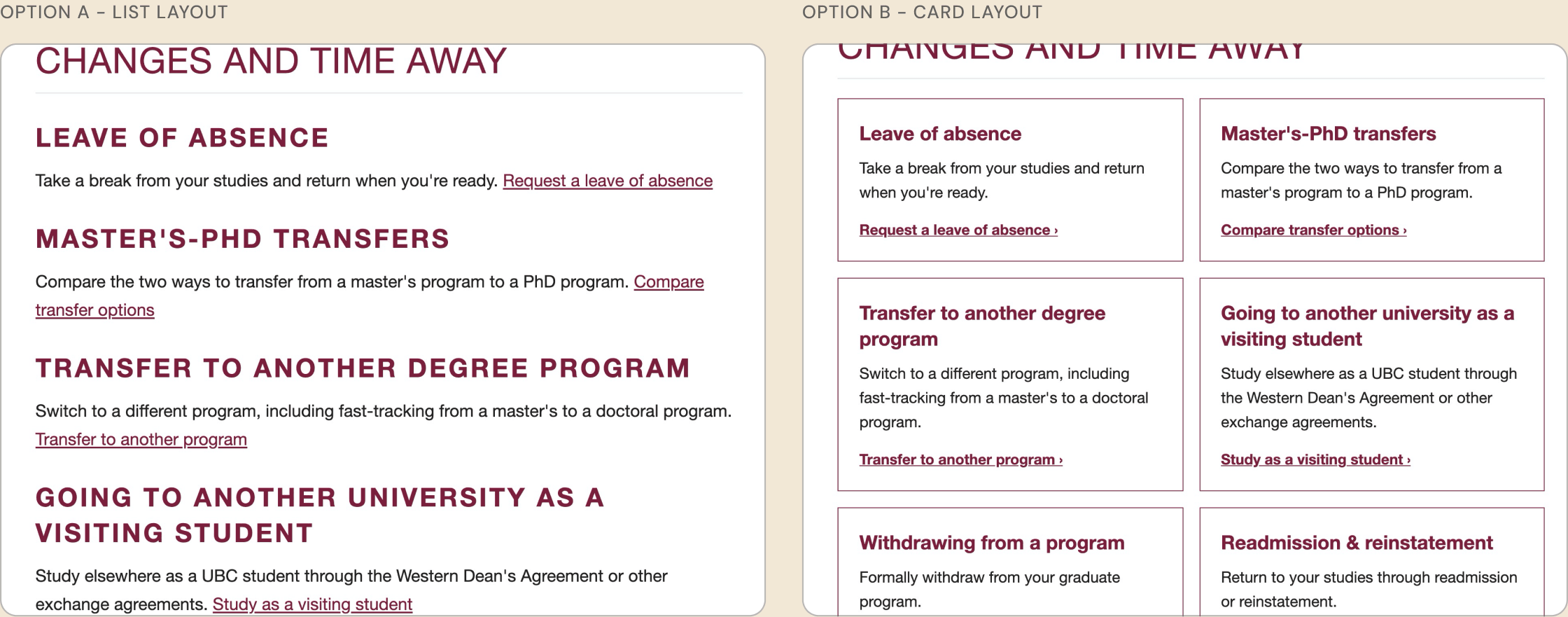
I showed a list layout and a card layout side by side so the team could choose.
Showing both layouts let the team see the tradeoff themselves: the list is faster to scan, while cards fit a short description and a clear link for each topic.
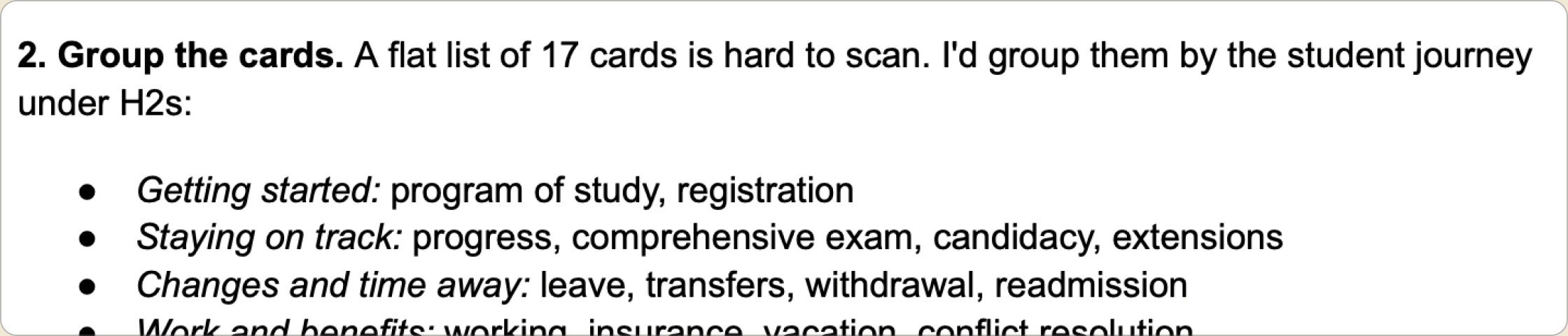
Putting the rule under each recommendation made it a conversation about standards, not preferences.
7e
Building it in Drupal
I implemented the redesigns myself in Drupal, the CMS the site runs on. The new pages are built on the site's dev environment, ready for the team to launch.
I wrote HTML on top of the site's existing widget components, like cards, column layouts, and collapsible headings, so new pages stay consistent with the live design.
Building it myself meant I could fix spacing and wording in place, instead of handing off specs and waiting for another round.
Figma / preview
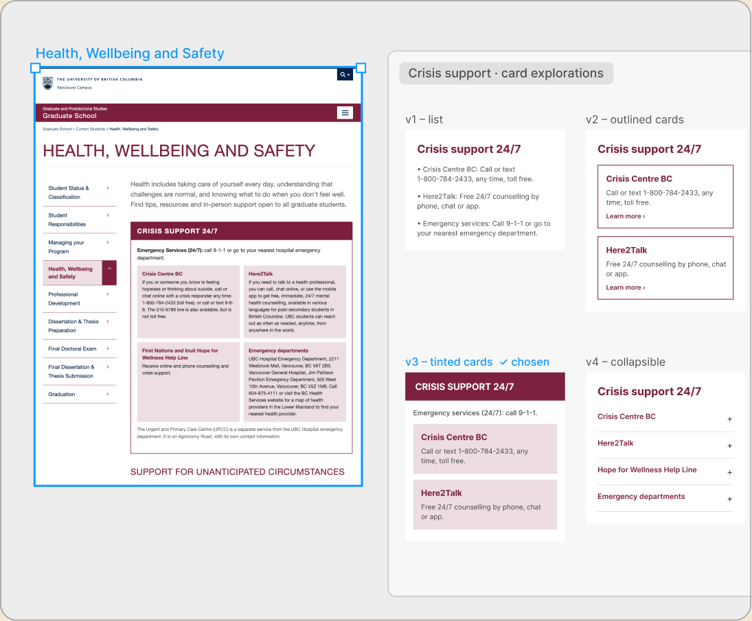
Drupal editor
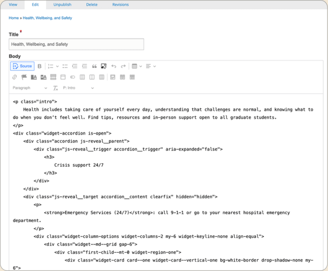
Designed within the system, so nothing broke on handoff.
Validation
Testing on the dev site with Crazy Egg
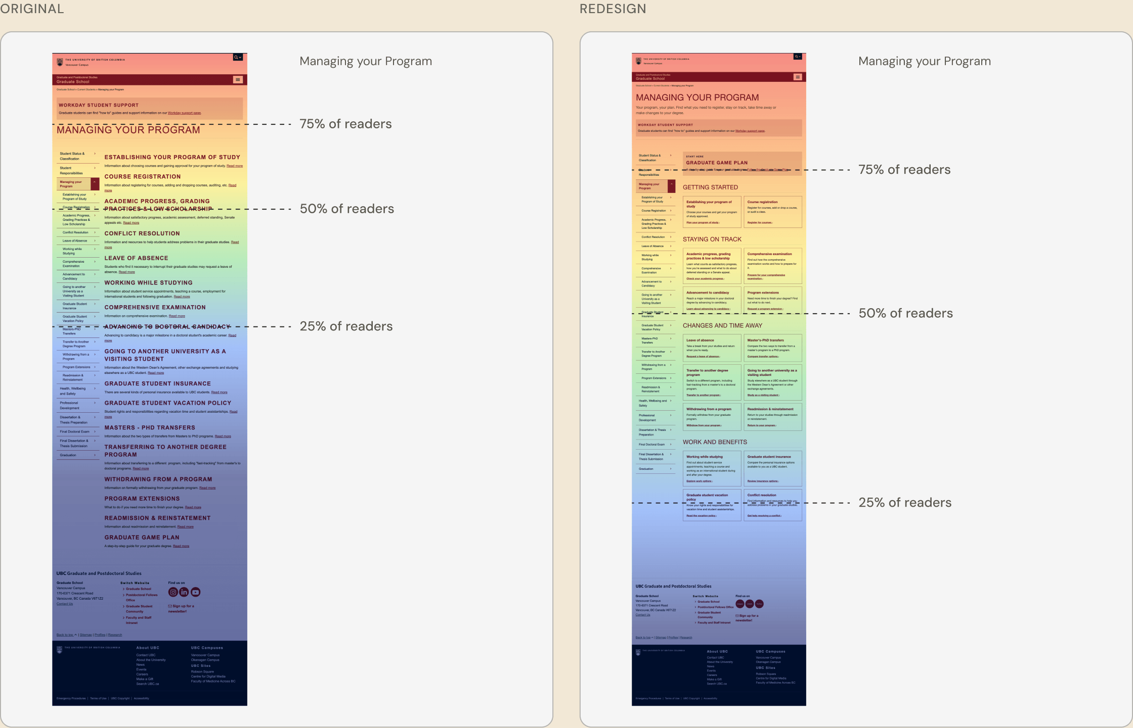
Before launch, I A/B tested the redesigned pages on the dev site against the current versions, using Crazy Egg heatmaps, scroll maps, scroll depth and time on page.
+65%
Scroll depth on the redesigned Managing your Program page on the dev site versus the current page, over 2 weeks.
Reflection
Citing a standard turns debates into decisions
I learned that citing a written standard under every edit turned style debates into quick decisions, and kept content owners on board when their text moved.
Next case study
Turning teacher and PA availability into a schedule one admin can trust
Enactus UBC · Workshop Scheduler
Read the case study →