Case study · Enactus UBC
Turning teacher and PA availability into a schedule one admin can trust
- Design Systems
- Product Design
- Accessibility
- Design-Dev Handoff
Status: Live prototype · iterating
- Role
- UI/UX Designer, sole designer on this ticket
- Team
- Enactus UBC Technology team (designers + devs)
- Timeline
- June 2026, second pass Oct 2026
- Tools
- Figma, shadcn/ui, Linear
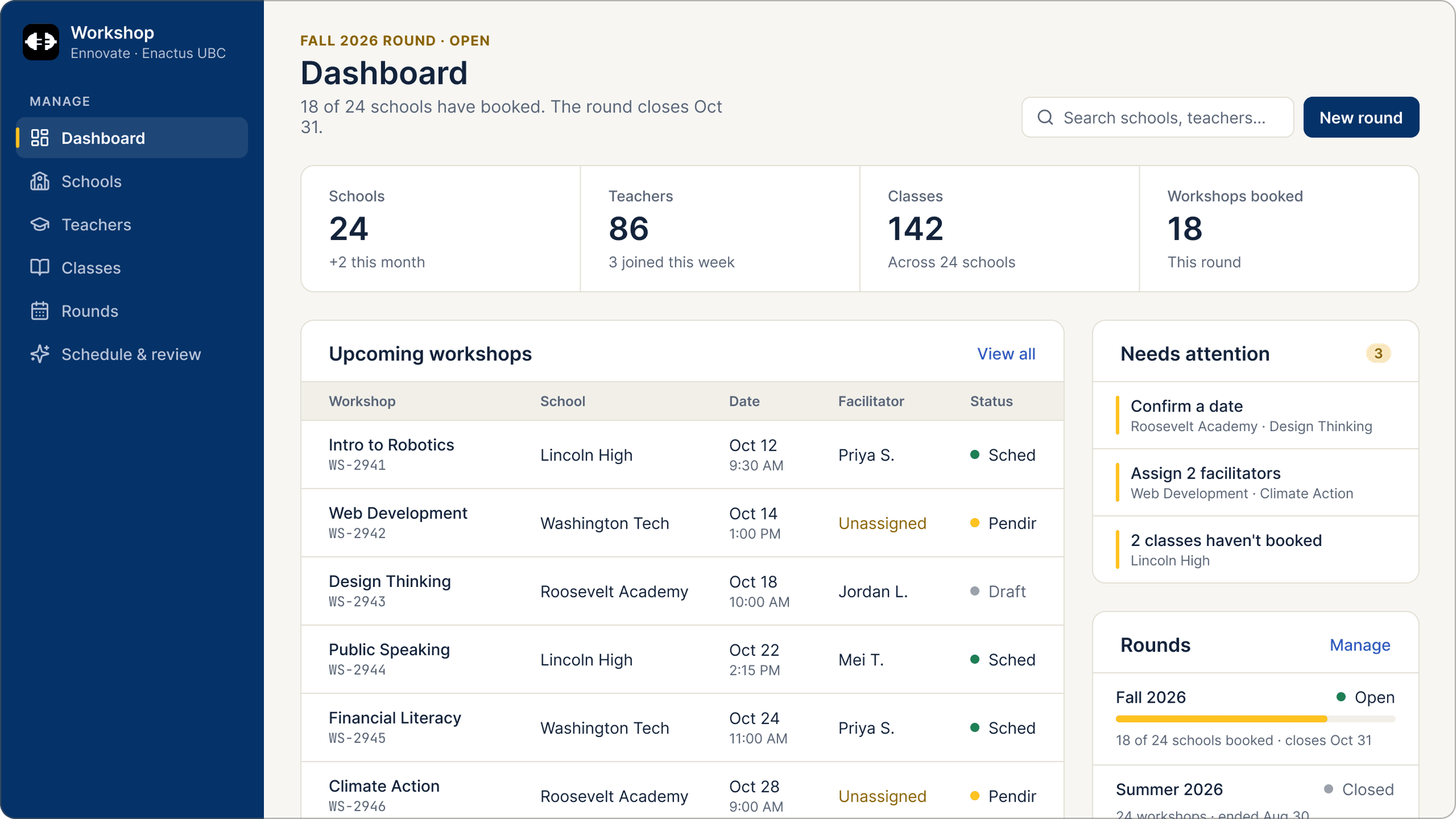

At a glance
A full product, not just a style guide
I designed the visual system, a component kit and 26 screens across three roles for Enactus UBC’s Workshop Scheduler, plus the PRD and token mapping for the devs. The first version is live as a coded prototype, and the team is iterating on it with feedback.
26
screens across 3 roles, including empty, error and no-access states
17
color tokens, with one variable swap per brand
4
component sets mapped to shadcn/ui
Context
Enactus UBC runs monthly workshops at partner schools. The Workshop Scheduler is a platform to manage them for three kinds of users.
As a UI/UX Designer on the Technology team, I owned the full design foundation for it.
Problem
Something devs could build directly
The dev team needed a visual system, components, and screens they could build from directly.
It had to work for three roles with different needs, and be co-branded across two programs: Ennovate UBC and Enspire UBC.
How might we let a small admin team schedule workshops across many schools, while teachers and PAs only see what needs them?
3
user roles: Admin, Teacher, and PA
2
co-branded programs
1
shared design system
Users
Three roles, three sets of needs
I wrote a persona for each role around its main goal and what it needs to see first after signing in.

Structure
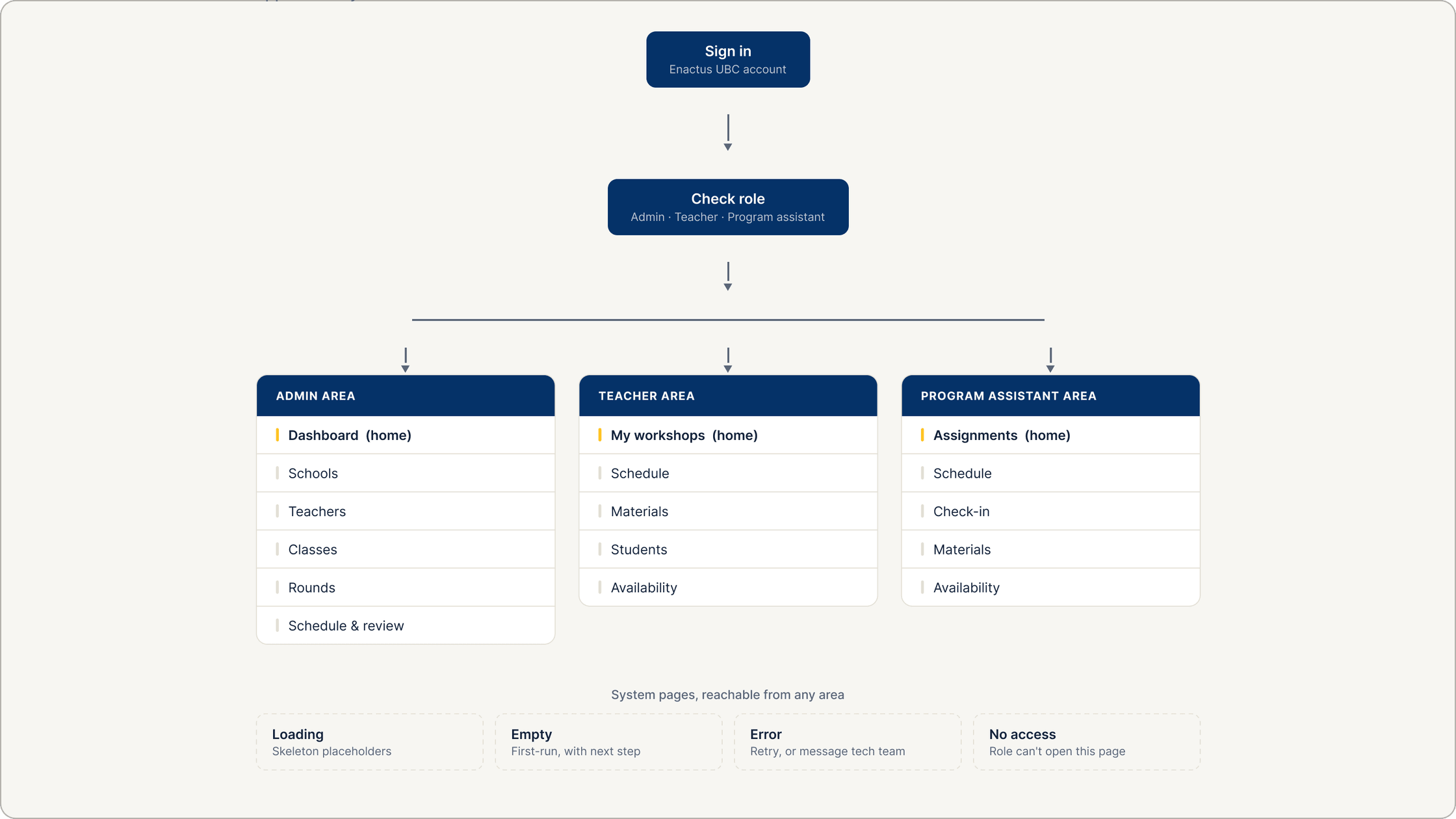
Every role lands on its own home
Solution
A system the devs could pick up and build
8a
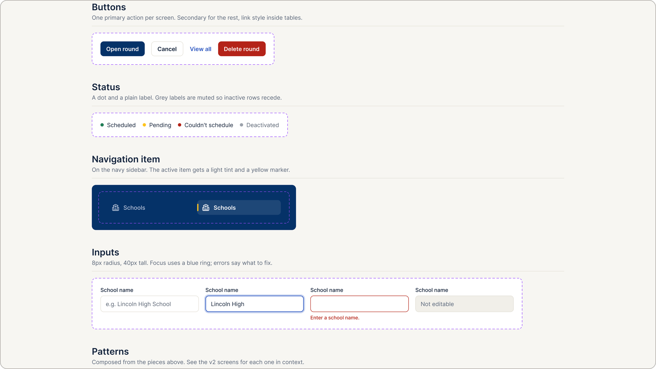
Colors borrowed from Enactus, each with one job
The first palette (charcoal, teal, gold) had no link to Enactus, and teachers usually meet the club through its website first. I pulled the colors from enactusubc.ca’s stylesheet so the tool feels like part of the club.
I kept the palette small on purpose: one dark, one link blue, one yellow for attention, and warm neutrals. With so few colors, each one can carry a meaning instead of decorating.
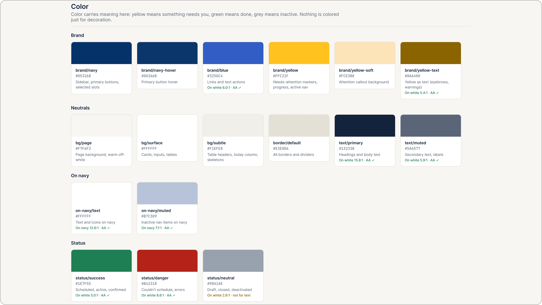
Enactus yellow is the brand’s most recognizable color, but at 1.62:1 on white it can’t be used for text. Darkening the brand color would have changed the brand, so instead each marker color became two tokens: the bright one for dots, bars and fills, and a darker text variant that passes AA.
Status also never relies on color alone. Every dot sits next to a plain label.

8b
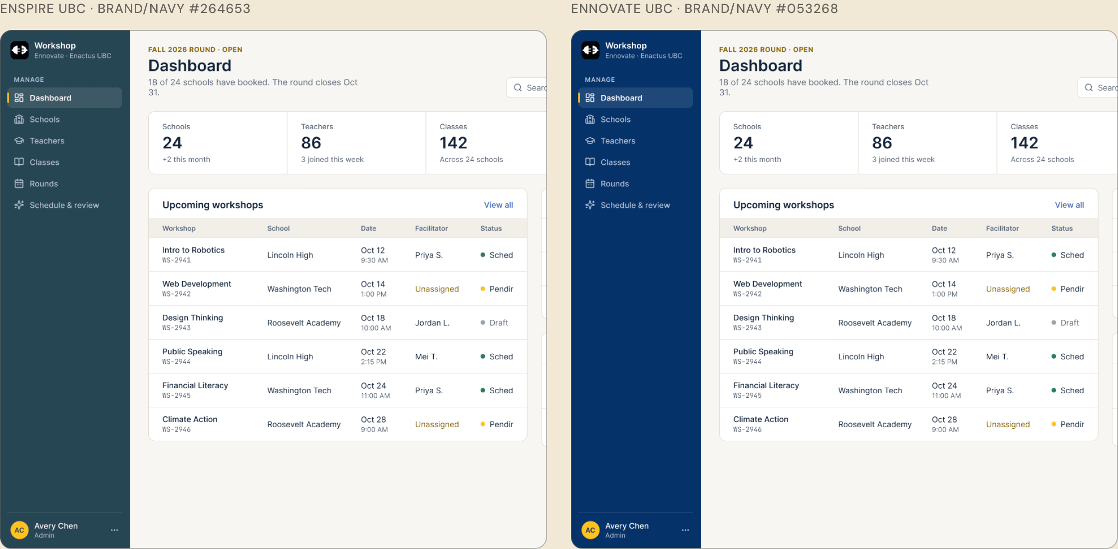
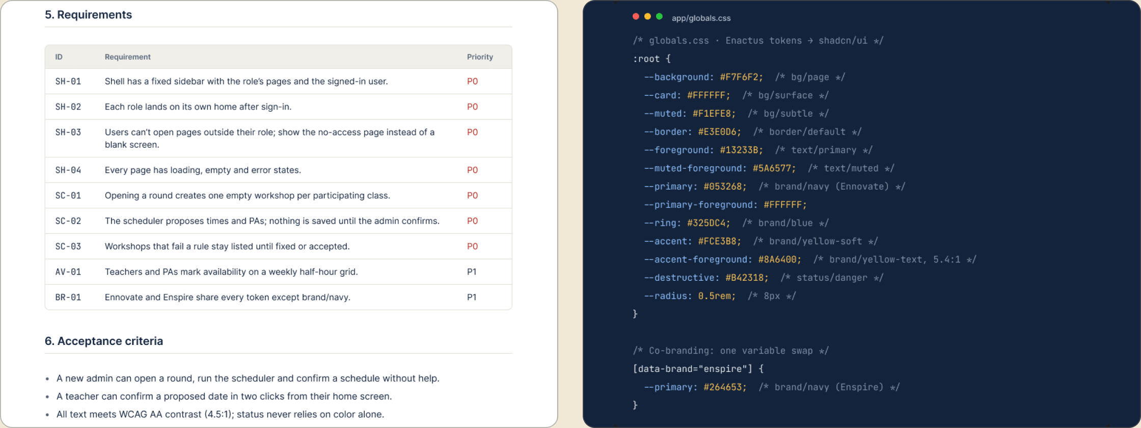
Two brands, one token swap
Ennovate and Enspire run the same workshops under different names. Two full themes would double the upkeep for a volunteer dev team, so the programs share every token except one.
8c
A component kit mapped to shadcn/ui
The devs build with shadcn/ui, so I named and structured the components to match it (Button, Badge, Input) instead of inventing my own. I also kept the kit to what the screens actually use. A smaller kit is easier for a student team to keep in sync with the code.
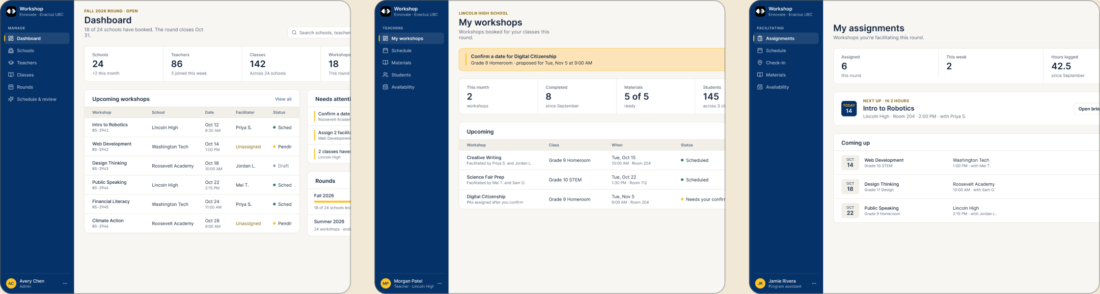
Three roles could have meant three separate apps. One shell with a role-specific sidebar means the devs maintain a single layout, and each role’s home page answers one question: what do I need to do now?
8d
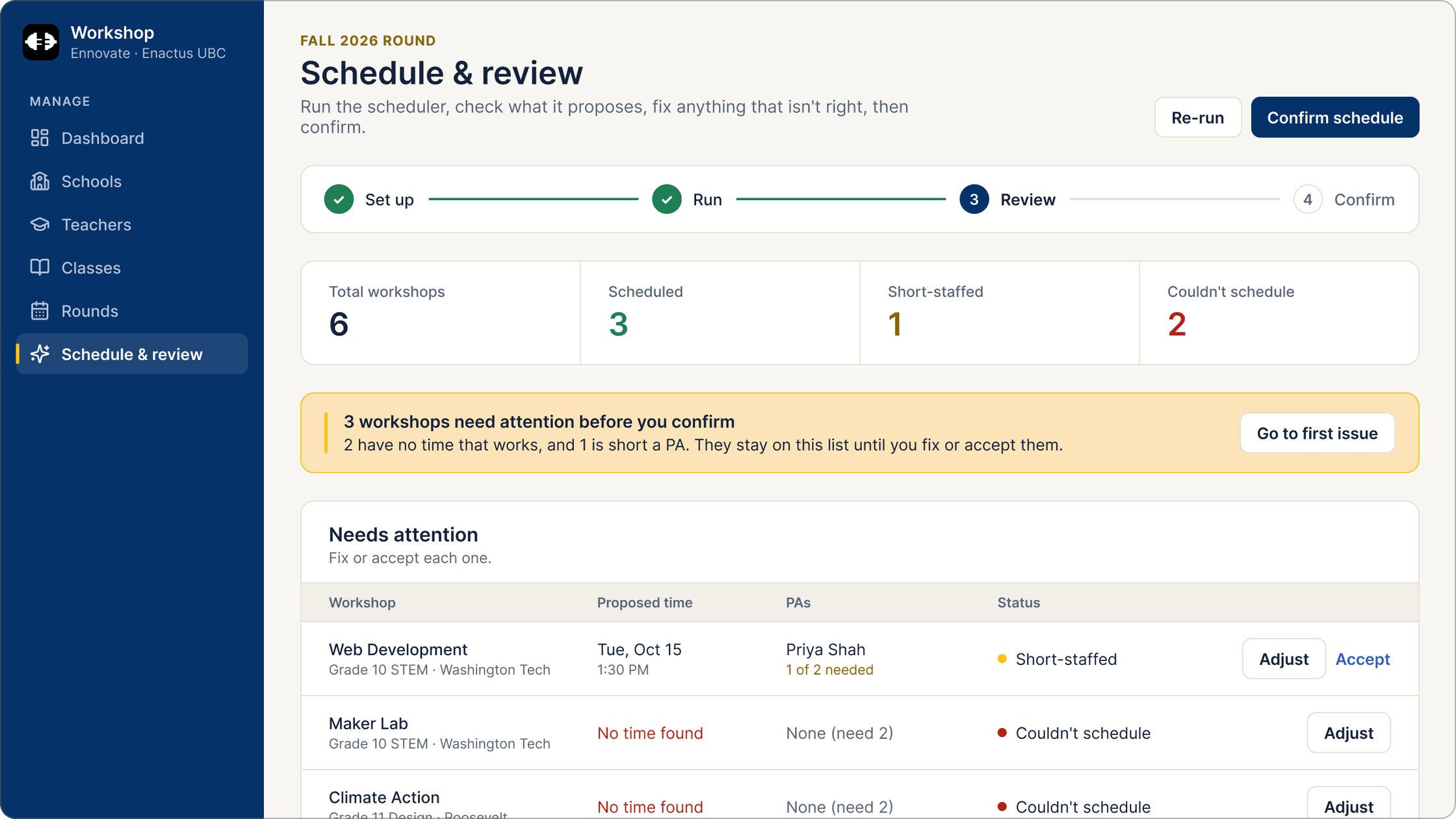
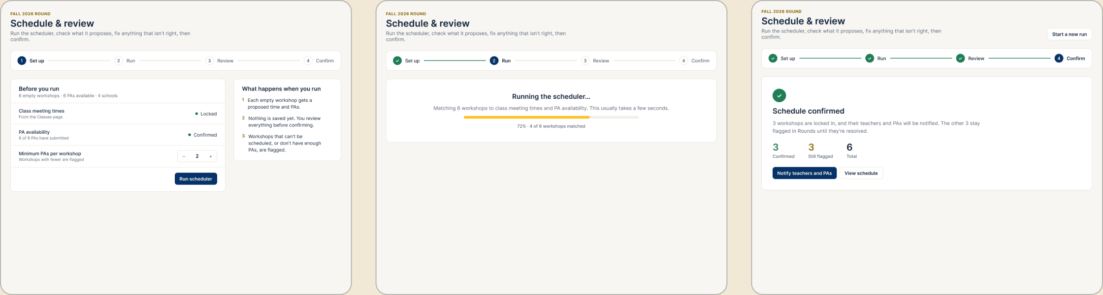
Nothing saves until the admin reviews it
Scheduling is a matching problem with hard rules: class meeting times, PA availability, and at least two PAs per workshop. An algorithm can solve most of it, but some workshops will have no valid time at all.
My first idea was to auto-confirm everything that passed and email the admin about the rest. But problems hidden in an email get missed, and a wrong booking at a partner school costs trust. So the scheduler only proposes. Problems are pulled to the top of the review and stay there until someone fixes or accepts them.
8e
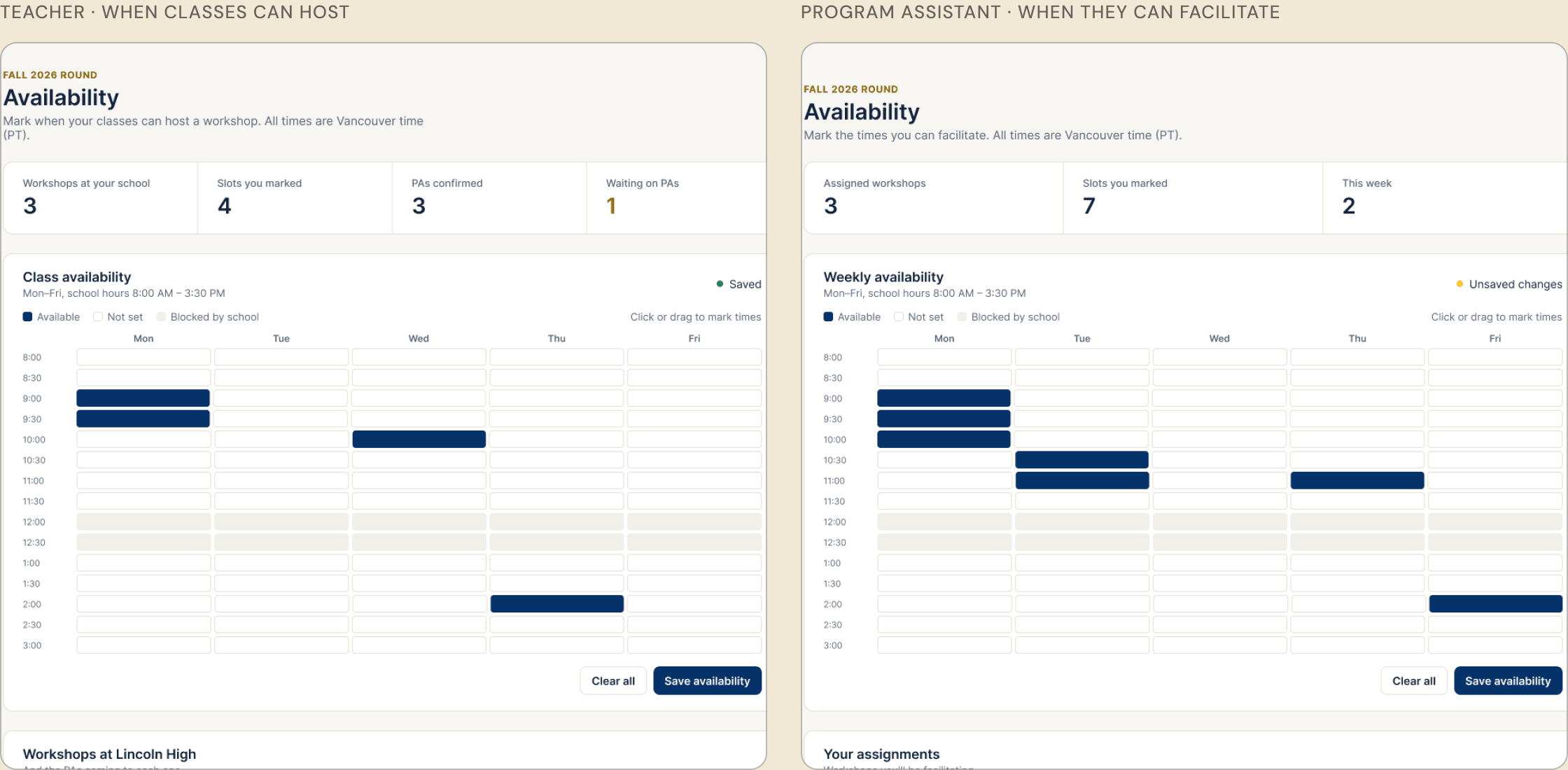
One availability grid for teachers and PAs
Teachers and PAs both have to say when they’re free. Separate forms would mean two mental models, and data the scheduler has to translate.
I chose a grid you paint over a time-picker form because people picture their week visually, and school blocks like lunch can be shown right where they apply.
8f
Designing the unhappy paths
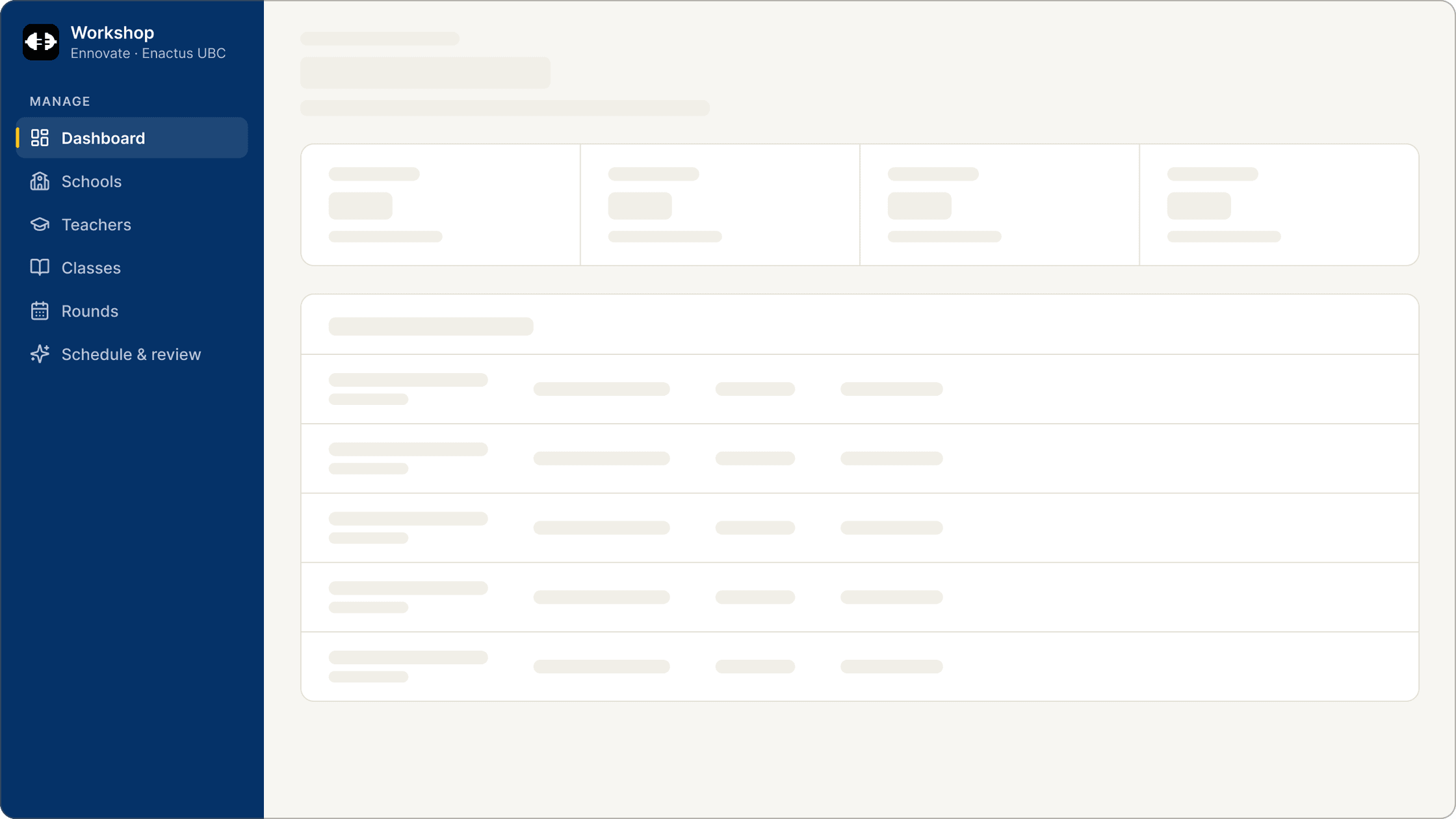
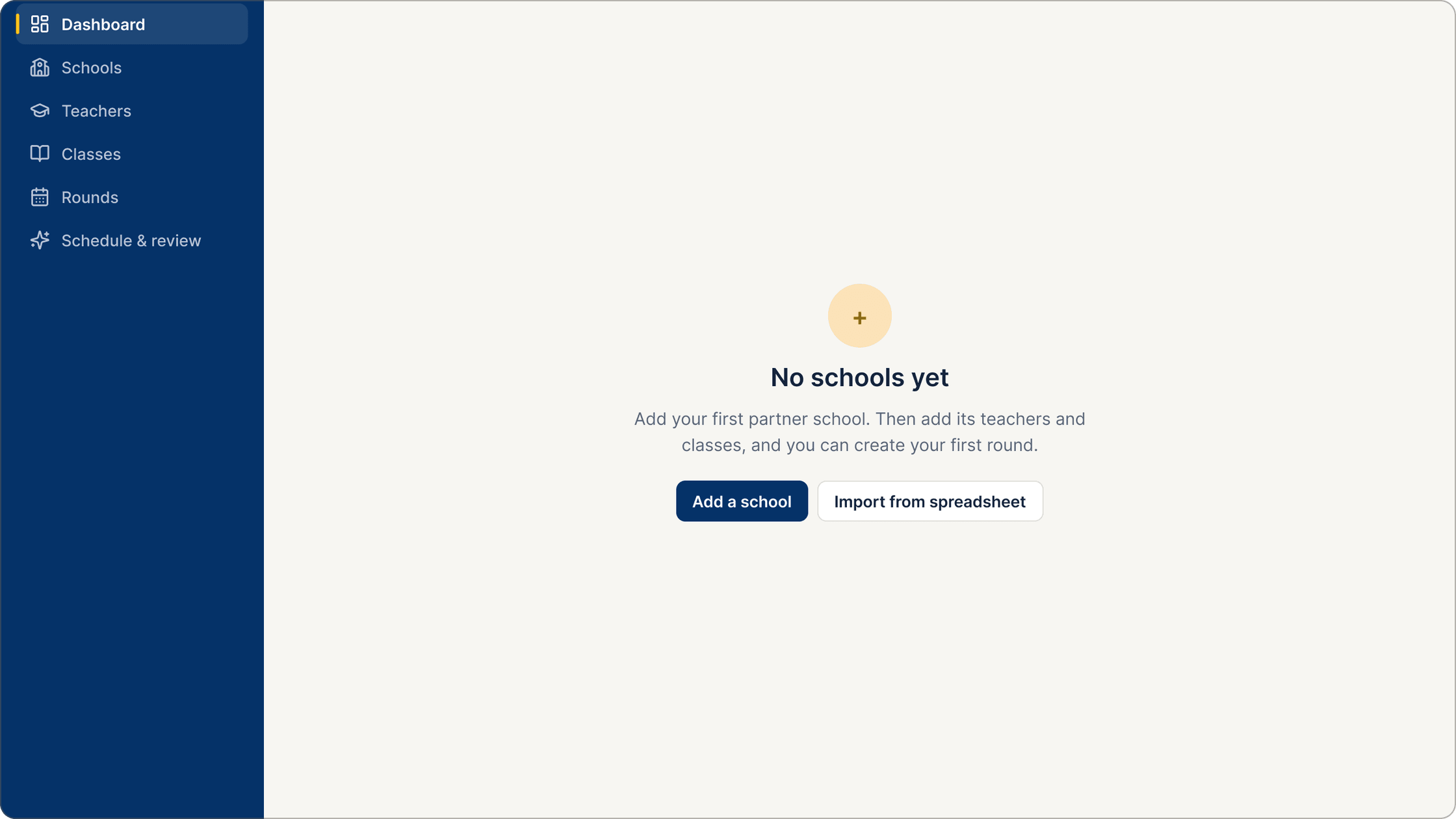
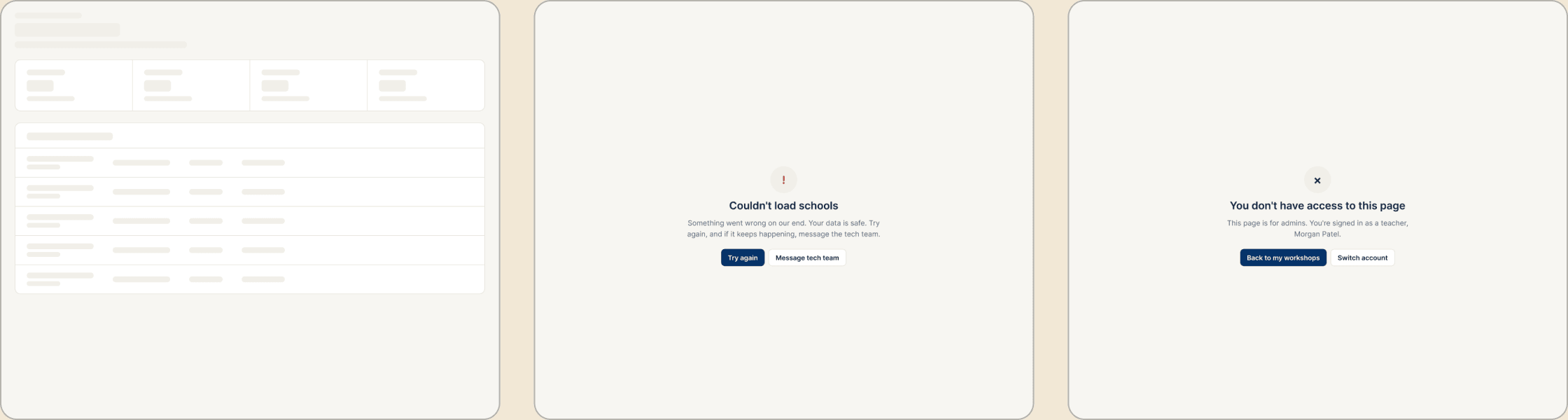
The first version only covered the happy path. A new admin opening the app would land on an empty dashboard with no idea where to start.
I designed a state for every way a page can be empty or fail, and each one tells the person what to do next.
8g
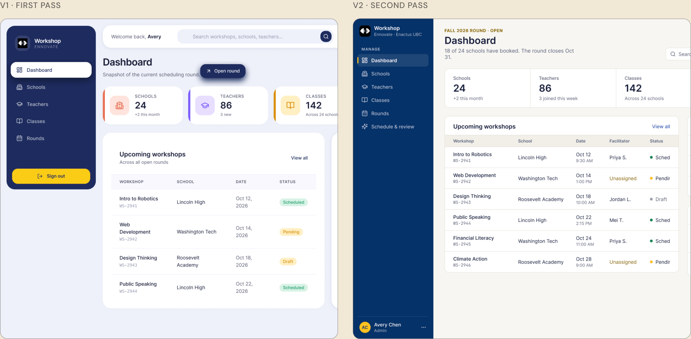
A second pass: making it feel like Enactus
8h
Handoff devs could build from
Outcome
A live prototype, improving through feedback
The first version is live as a coded prototype. We are iterating on it with feedback, and the second-pass design in 8g is the next version.
Reflection
What I learned
My first version leaned on dashboard defaults and looked generic. Taking the palette from Enactus’s own site, and giving every color one job, made the tool feel like it belonged to the club and made screens faster to scan.
Next case study
Turning a newsletter signup into direct school inquiries
Beewell Indonesia · Website redesign
Read the case study →